Since I guess there will be some problems and issues let's discuss them here and not in the change log thread.

The new Page Layout, while in darkmode, applies a filter: grayscale(50%) on every image. Is this intended?
Because it makes the page and especially the module pictures and your rack look really washed out.
-- temp_hill

What do you think, should that be reversed or tamed down?

Beep, Bopp, Bleep: [email protected]


Not reversed, but maybe scaled back to 25%. Then get another round of feedback. 50% is definitely too much to my eyes.


I really enjoy the dark mode so far. The only minor thing I was puzzled by is why the modules are also displayed in a muted version in dark mode. This threw me of a little this morning :D

I personally would prefer dark mode with regular modules, but that's just my 2 cents
gif of the dark mode, dark mode with bright modules and default mode


I'd prefer the dark mode not to affect the images of the modules as well. To me, it neither looks good nor does it make sense. A photo viewer in dark mode wouldn't alter the displayed images either, and the rack view is essentially a (very souped-up) photo gallery. Right now the modules look kinda sad ^_^


Fantastic... thank you for the dark mode! now just have to get used to it :)
I noticed the modules images tones' are slightly desaturated, It seems a bit too desaturated to me; it's pleasant artistically but it's not matching the real thing.


Reduced the filter to 25%. That should bring the color back in your life! For every new member complaining I add additional 5% until we hit 200%

Beep, Bopp, Bleep: [email protected]


How do I turn off darkmode? It's really not working for me. Sorry...


How do I turn off darkmode? It's really not working for me. Sorry...
-- Sedalus

Go to your user preferences and select "Light" in the Color Scheme select box.
https://www.modulargrid.net/e/users/edit

Beep, Bopp, Bleep: [email protected]


How do I turn off darkmode? It's really not working for me. Sorry...
-- Sedalus

Go to your user preferences and select "Light" in the Color Scheme select box.
https://www.modulargrid.net/e/users/edit
-- modulargrid

Awesome. Thanks!


Ahhhh...I and my retinas thank you! The dark mode is quite nice, particularly when heading to bed after getting done on MG. The modules look...OK?...but I can see what people are talking about with the washed-out look. Maybe try halving the current grayscale filter's setting from 25% down to 12-13%, and that should nail it while still keeping the dataset small(ish).


Looks pretty good! The dropdown in the Module Finder are very Aqua, with the reflections. I think it's pretty distracting, can the dropdowns be flattened a bit?


Reduced the filter to 25%. That should bring the color back in your life! For every new member complaining I add additional 5% until we hit 200%
-- modulargrid

This looks really good to me now.


The modules look...OK?...but I can see what people are talking about with the washed-out look.
-- Lugia

I noticed the modules images tones' are slightly desaturated, It seems a bit too desaturated to me; it's pleasant artistically but it's not matching the real thing.
-- metrowave

I'd prefer the dark mode not to affect the images of the modules as well.
-- ApolaKipso

The image filter is now gone.

The dropdown in the Module Finder are very Aqua, with the reflections. I think it's pretty distracting, can the dropdowns be flattened a bit?
-- subframe

That is an iOS issue, those select boxes are hard to style. You have to use CSS I would categorize as "hacky" e.G. remove the aqua and fake in those down triangles... Nonetheless now they are flat but don't look like selects anymore, need feedback if that is better or worse?

Beep, Bopp, Bleep: [email protected]


Not per se a dark mode issue, but I can no longer zoom out to view my full rack on iPad Safari.


I'm glad we didn't end up with the 200% grayscaled images, I mean can you imagine πŸ˜‚


The dropdown in the Module Finder are very Aqua, with the reflections. I think it's pretty distracting, can the dropdowns be flattened a bit?
-- subframe

That is an iOS issue, those select boxes are hard to style. You have to use CSS I would categorize as "hacky" e.G. remove the aqua and fake in those down triangles... Nonetheless now they are flat but don't look like selects anymore, need feedback if that is better or worse?

Yep, looks better and cleaner to me. However, after selecting an item from the dropdown, the text is black and hard to read. Can you make it white or grey?


Not per se a dark mode issue, but I can no longer zoom out to view my full rack on iPad Safari.
-- erdgeist

That is strange, which rack is it?

I'm glad we didn't end up with the 200% grayscaled images, I mean can you imagine πŸ˜‚
-- ApolaKipso

New feature: the color gradually fades as your unicorn account approaches the expiration date, just kidding ;)

Yep, looks better and cleaner to me. However, after selecting an item from the dropdown, the text is black and hard to read. Can you make it white or grey?
-- subframe

That should work now..

Beep, Bopp, Bleep: [email protected]


Dropdowns looks great, thank you!


Not per se a dark mode issue, but I can no longer zoom out to view my full rack on iPad Safari.
-- erdgeist

That is strange, which rack is it?

Seems to be a problem with all wider racks. For example ModularGrid Rack


Seems to be a problem with all wider racks.
-- erdgeist

I have reverted some changes wich might be the cause for the problem. Does that fix your problem?

Beep, Bopp, Bleep: [email protected]
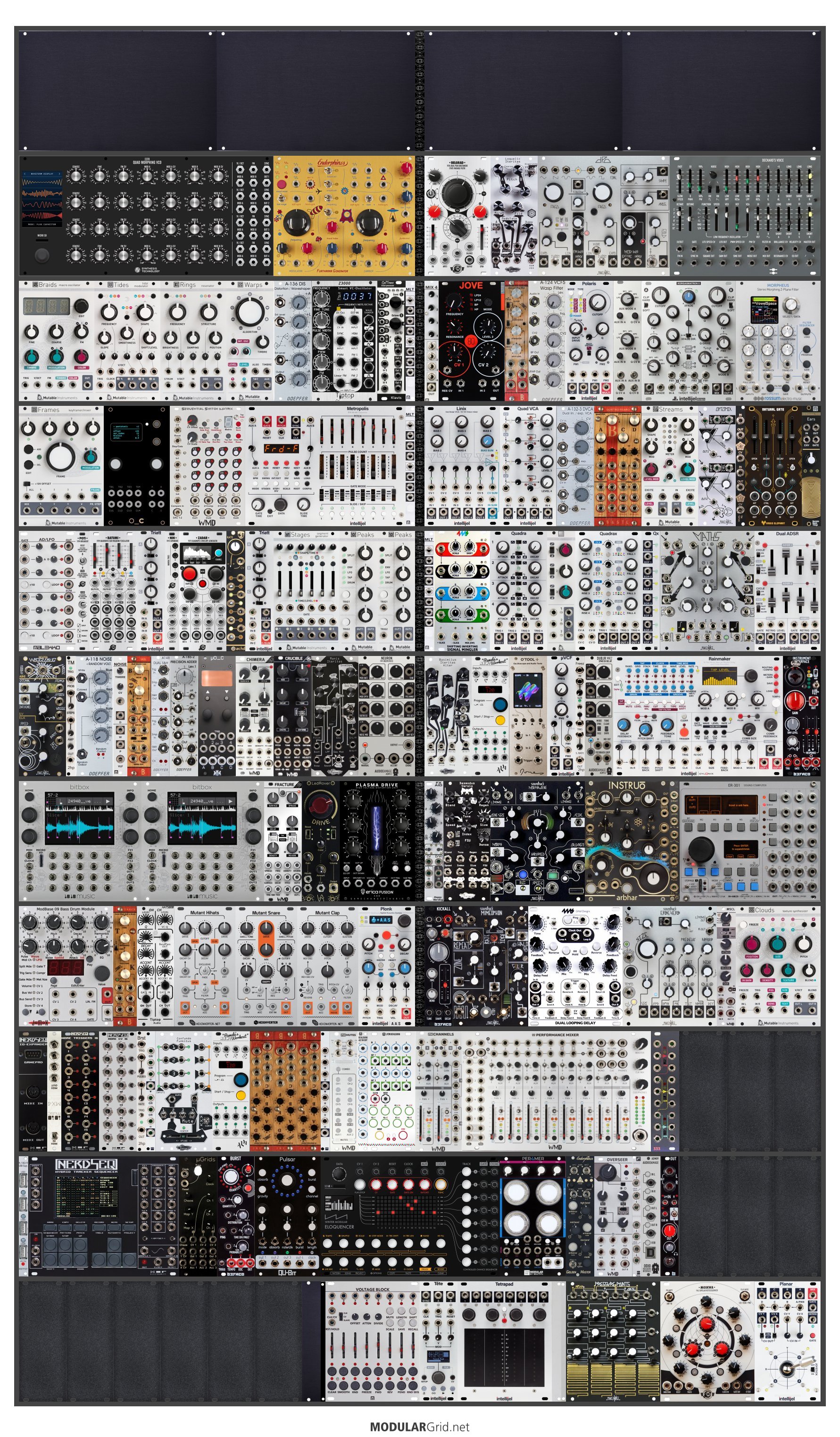

Seems to be a problem with all wider racks.
-- erdgeist

I have reverted some changes wich might be the cause for the problem. Does that fix your problem?
-- modulargrid

Perfect, it’s working now.


Really like the dark mode. Great work. Thanks.


Seems to be a problem with all wider racks.
-- erdgeist

I have reverted some changes wich might be the cause for the problem. Does that fix your problem?
-- modulargrid

I noticed screenshots of wider racks (anything above 119 HP), the image is always cropped I tried different racks and width:
https://cdn.modulargrid.net/img/racks/modulargrid_1551097.jpg


I noticed screenshots of wider racks (anything above 119 HP), the image is always cropped I tried different racks and width:
https://cdn.modulargrid.net/img/racks/modulargrid_1551097.jpg

-- metrowave

This should be work now, thanks for reporting!

Beep, Bopp, Bleep: [email protected]


Dropdowns looks great, thank you!
-- subframe

Oh, I still see the Aqua/reflective dropdown in Safari on my mac. I see the new flat look on iOS, but not macOS for some reason.


That is Apples idea how a default drop down should look. Every attempt to restyle those elements is a bit hacky and has other disadvantages. The new "dropboxes" on iOS have the dropbox appearance disabled so they look flat. But from UI perspective they are no dropboxes anymore which can be problematic. I hope that Apple will just tone them done a bit in the future.

Beep, Bopp, Bleep: [email protected]


To disable Native Apple UI in Safari you can set the "-webkit-appearance" style to none;


To disable Native Apple UI in Safari you can set the "-webkit-appearance" style to none;
-- defragmenteur

Yes, I know but the dropdown menu would not look like a dropdown anymore and you have to fake in that down triangle icon and that triangle icon will not register clicks so the dropbox would not open and than you can add javascript to prevent that, etc.
Not worth it imho just to get flatter dropdowns on Safari which might come "for free" with a next Apple update.
Anyway: "ModularGrid? Isn't that the tasteful site with the beautiful webdesign?" said no one ever ;)

Beep, Bopp, Bleep: [email protected]


I notice that there seems to be no way (anymore) to go from a users list of marketplace entries directly to a specific offer. You can click on the module name and end on the module page and can then open the offer (if you remember the users name) from there, but that seems complicated. Would be nice if there was an additional link to the offer directly, which existed before.


I notice that there seems to be no way (anymore) to go from a users list of marketplace entries directly to a specific offer.

That should work again, thanks for the report.


That should work again, thanks for the report.

-- solitud

Fantastic, thank you!


regarding dark mode, changing the blue of links could be nice ...


On the "Command Centre" (sorry..."center") display, could we please have the any incomplete rows left-justified rather than fully justified? As a graphic designer, I start to cry when I see three racks spread apart on the final row, after seeing evenly spaced racks above (this wasn't the case before). Whilst I'm at it, could the rows also be padded out so that the tops of all the cases align regardless of the length of the case title - e.g. make it like a spreadsheet table where you have a row of case titles above a row of cases. Perhaps user-selectable options for the visual sizes of cases too (they got smaller after recent updates). Cheers!


On the "Command Centre" (sorry..."center") display,

I guess you mean the Kommandozentrale

could we please have the any incomplete rows left-justified rather than fully justified? As a graphic designer, I start to cry when I see three racks spread apart on the final row, after seeing evenly spaced racks above

I know what you mean. The graphic designer and the web developer had heated discussions above that topic. That was not very productive especially since they are the same person. (web developer always wins)

Whilst I'm at it, could the rows also be padded out so that the tops of all the cases align regardless of the length of the case title - e.g. make it like a spreadsheet table where you have a row of case titles above a row of cases.
-- AndyQ

Understand. Will look into it and give it another shot ...

Beep, Bopp, Bleep: [email protected]


I know what you mean. The graphic designer and the web developer had heated discussions above that topic. That was not very productive especially since they are the same person. (web developer always wins)
-- modulargrid

Yep, I'm the same, but my graphic/UI designer side always wins and the web developer side has to put in the extra hours to make it happen, which is why everything I do....takes ....so.....long...

Thanks!


could we please have the any incomplete rows left-justified rather than fully justified?

that should work now.

Whilst I'm at it, could the rows also be padded out so that the tops of all the cases align regardless of the length of the case title

could not get it to work without compromises, e.G. truncated text and fixed heights. That is more limiting than it does good so I leave it for now.

Beep, Bopp, Bleep: [email protected]


could we please have the any incomplete rows left-justified rather than fully justified?
that should work now. > -- modulargrid

Thanks!