Ok - trying to organize my four separate cases and yes, MG helps a lot with that.

A few features could make planning a lot easier, though.

  • I'd like to "lock" the rows and/or modules which I have already happily planned. So - I'd like to lock something and then try to optimize the rest automatically to optimize the space
  • Multiple cases on one view to drag n drop modules from one to another (copy & paste helps with this now on separate browser pages)

Otherwise this service is phenomenal, thanks a lot for it!


Since you've got the Unicorn account, you could always set up all of the cases as a single 'mock-up' in a single case layout, and use the various blind panel 'dividers' in a proper case style to give you the right appearance. Of course, this gets limited if the cases, side by side, exceed the maximum row length, but you could still do this as two-over-two or something similar. Just make sure to do the math to allow for the extra 4hp or whatever to put in the dividers for the whole system mock-up. Done this a number of times, and it's worked well for me.


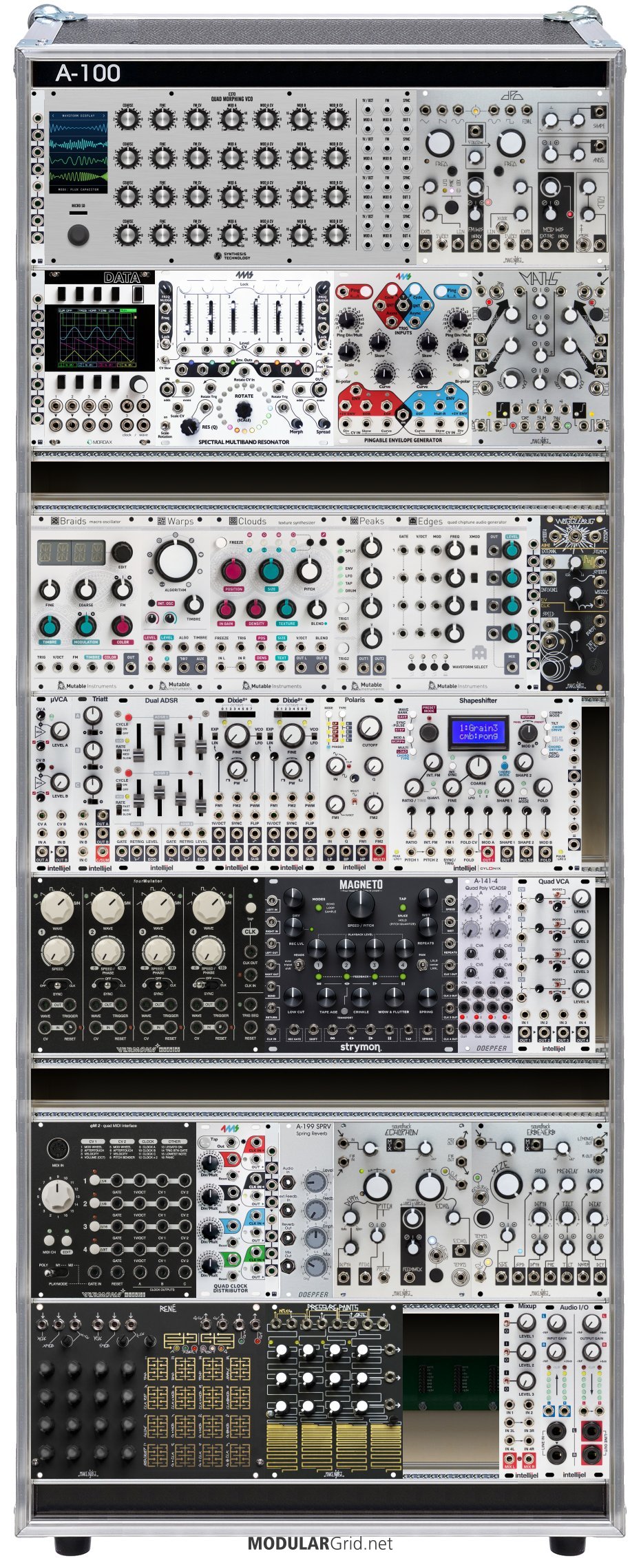
Yep - started planning with a single "tower" instead of three separate cases to ease layout planning. And your divider idea gave me an idea to put additional 1U rows to separate cases from each other! This way it looks like the real deal.

Still - it would be awesome if I could lock certain rows and try to "optimize" the rest. And yesterday I came with an idea to have "groups of modules" - so that I could group some modules together and then move it as one group. And if you'd organize automatically - it would respect this group without separating the modules.


This is the current plan

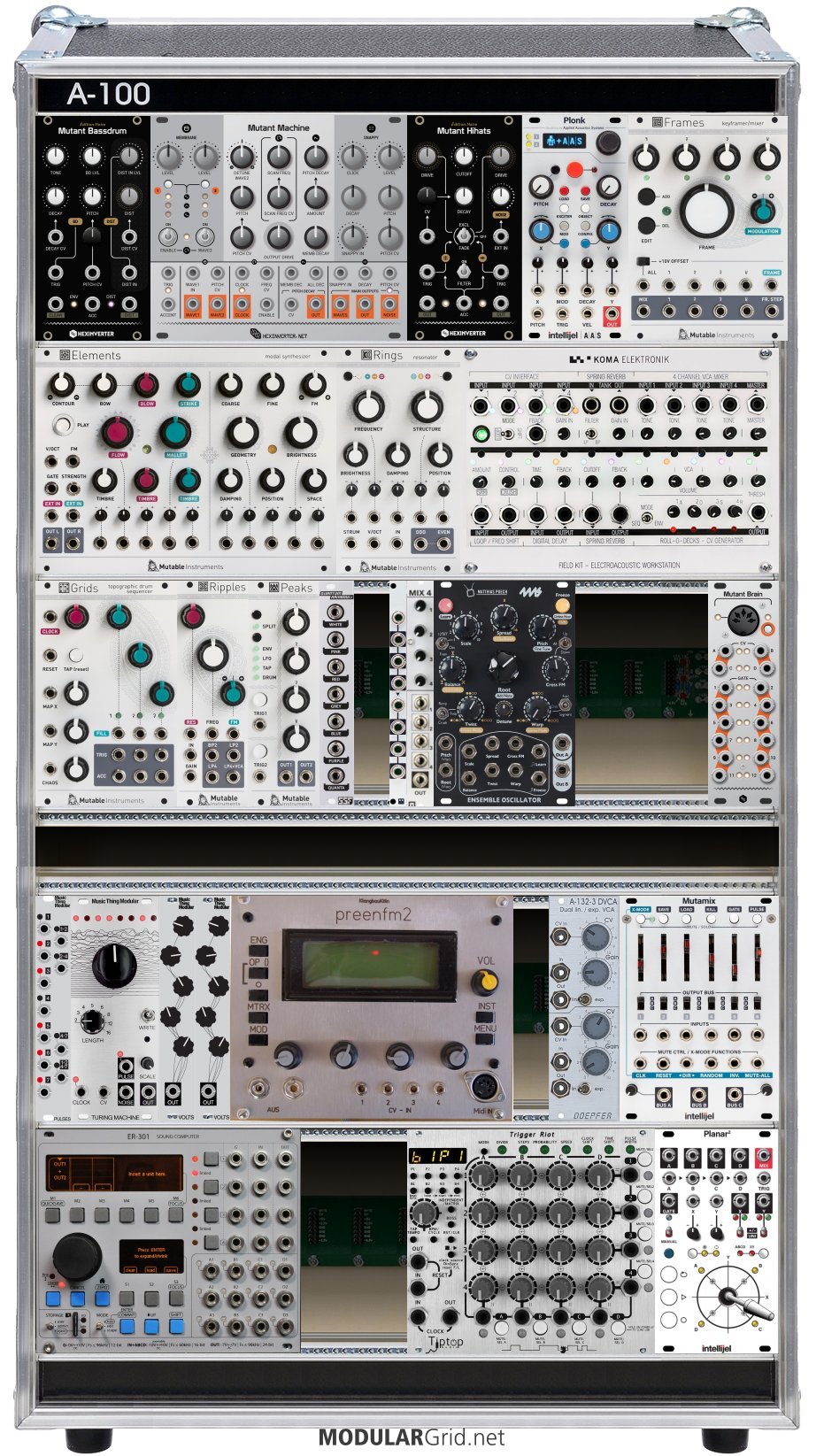
And the second "tower"


Not bad! Yeah, there's a few things I'd do a little differently, but otherwise I can see what you seem to be aiming for here, and it looks good. The use of the 1U rows does a nice job of splitting up the cabs, but you could also side-by-side the first and second towers and fill with blanks where there's not anything. I'd go more into the architecture of the modules themselves, but that would be sort of OT for this topic.


Feedback would be great, avtually! I could create a separate topic for that if you’d like to comment. :)


Not bad! Yeah, there's a few things I'd do a little differently, but otherwise I can see what you seem to be aiming for here, and it looks good. The use of the 1U rows does a nice job of splitting up the cabs, but you could also side-by-side the first and second towers and fill with blanks where there's not anything. I'd go more into the architecture of the modules themselves, but that would be sort of OT for this topic.
-- Lugia

Now there's a new post about the build if you'd like to comment! :)

https://www.modulargrid.net/e/forum/posts/index/2826